> ## Documentation Index
> Fetch the complete documentation index at: https://docs.claimr.io/llms.txt
> Use this file to discover all available pages before exploring further.
# Interactive components UX requirements
> UX design requirements for buttons and input fields within your Claimr campaigns, ensuring they are user-friendly, accessible, and visually appealing.
Interactive components, such as buttons and input fields, are essential elements for gathering user information and enabling interactions within your Claimr campaigns. Designing user-friendly interactive components is crucial for ensuring a smooth and efficient user experience.
## Log in / Log out buttons
Facilitate user authentication and session management.
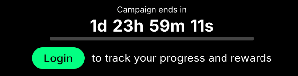
 * **Clear labels:** Use concise and descriptive labels like "Log In" and "Log Out."
* **Visual distinction:** Differentiate the two buttons through color, styling, or placement.
* **Feedback:** Provide visual feedback upon interaction, such as a loading state or change in button appearance.
* **Accessibility:** Ensure buttons have clear focus states.
## Action buttons
Trigger specific actions within the campaign (e.g., "Submit," "Next," "Follow").
* **Clear labels:** Use concise and descriptive labels like "Log In" and "Log Out."
* **Visual distinction:** Differentiate the two buttons through color, styling, or placement.
* **Feedback:** Provide visual feedback upon interaction, such as a loading state or change in button appearance.
* **Accessibility:** Ensure buttons have clear focus states.
## Action buttons
Trigger specific actions within the campaign (e.g., "Submit," "Next," "Follow").
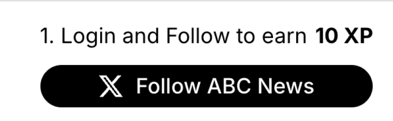
 * **Clear labels:** Use action-oriented verbs that accurately describe the button's function.
* **Visual hierarchy:** Make action buttons prominent and visually distinct from other elements.
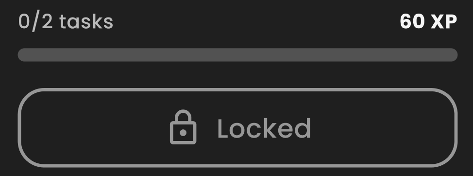
* **Disabled state:** Clearly indicate when a button is disabled (e.g., grayed out, with a tooltip explaining why).
* **Feedback:** Provide visual feedback upon interaction, such as a loading state or change in button appearance.
## Checkbox
Allow users to select or deselect options.
* **Clear labels:** Use action-oriented verbs that accurately describe the button's function.
* **Visual hierarchy:** Make action buttons prominent and visually distinct from other elements.
* **Disabled state:** Clearly indicate when a button is disabled (e.g., grayed out, with a tooltip explaining why).
* **Feedback:** Provide visual feedback upon interaction, such as a loading state or change in button appearance.
## Checkbox
Allow users to select or deselect options.
 * **Clear labels:** Provide concise labels adjacent to checkboxes, describing the corresponding options.
* **Visual states:** Clearly differentiate between checked, unchecked, and disabled states using distinct visual cues (e.g., checkmark, empty box, grayed-out box).
* **Hit area:** Make the clickable area surrounding the checkbox large enough for easy interaction.
## Text input
Enable users to enter textual information.
* **Clear labels:** Provide concise labels adjacent to checkboxes, describing the corresponding options.
* **Visual states:** Clearly differentiate between checked, unchecked, and disabled states using distinct visual cues (e.g., checkmark, empty box, grayed-out box).
* **Hit area:** Make the clickable area surrounding the checkbox large enough for easy interaction.
## Text input
Enable users to enter textual information.
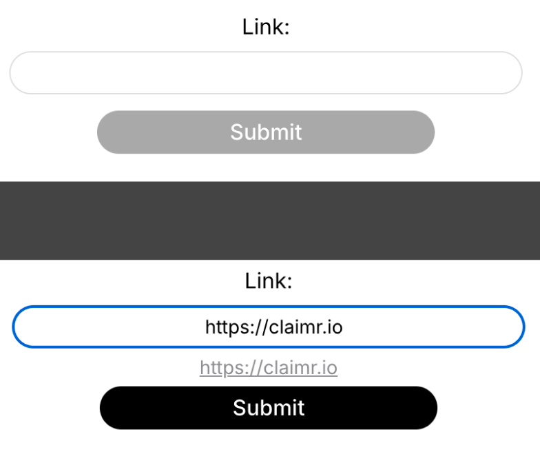 * **Clear labels:** Provide descriptive labels above or adjacent to input fields.
* **Input field size:** Adjust the input field size appropriately based on the expected input length.
* **Placeholder text/hint:** Use placeholder text or hints to guide users on the expected input format or content.
* **Disabled state:** Clearly indicate when an input field is disabled (e.g., grayed out).
* **Error handling:** Provide clear error messages and guidance if input validation fails.
## Upload image
Allow users to upload image files.
* **Clear labels:** Provide descriptive labels above or adjacent to input fields.
* **Input field size:** Adjust the input field size appropriately based on the expected input length.
* **Placeholder text/hint:** Use placeholder text or hints to guide users on the expected input format or content.
* **Disabled state:** Clearly indicate when an input field is disabled (e.g., grayed out).
* **Error handling:** Provide clear error messages and guidance if input validation fails.
## Upload image
Allow users to upload image files.
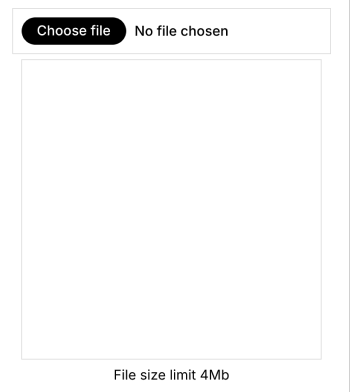
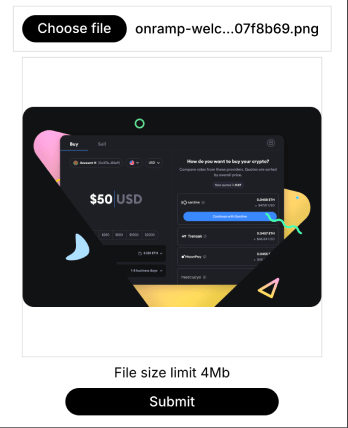
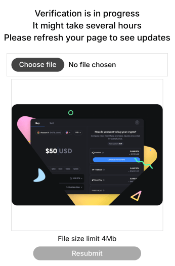 * **Clear CTA:** Use a clear button or label (e.g., "Upload Image") to initiate the upload process.
* **File selection:** Provide a standard file selection dialog for users to choose an image file.
* **Image preview:** Display a preview of the uploaded image before submission.
* **File validation:** Implement file type and size validation to prevent errors.
* **Error handling:** Provide clear error messages if file validation fails.
* **Accessibility:** Ensure the upload process is accessible to screen readers and keyboard users.
* **Clear CTA:** Use a clear button or label (e.g., "Upload Image") to initiate the upload process.
* **File selection:** Provide a standard file selection dialog for users to choose an image file.
* **Image preview:** Display a preview of the uploaded image before submission.
* **File validation:** Implement file type and size validation to prevent errors.
* **Error handling:** Provide clear error messages if file validation fails.
* **Accessibility:** Ensure the upload process is accessible to screen readers and keyboard users.