
- Go to Campaigns.
- Select the campaign you want to configure.
- Open the Customization menu.
- Select Widget settings.
User progress
User progress settings control whether users can see their own progress, switch accounts, or view profile details inside the widget. These options affect how much visibility and control users have over their activity and identity in the campaign.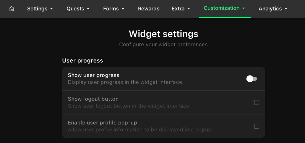
- When enabled, users see their current progress at the top of the widget.
- Recommended if you want to motivate users with visible feedback.
- Can be disabled if you prefer a minimal, distraction-free widget.
- Allow users to log out from the widget when they want to disconnect their account or switch to a different one.
- Opens a popup with user profile details.
- Useful when campaigns use profile-based data.
- Can be disabled for simple use cases where profile data is not needed.
Localization
Localization settings control whether users can select their preferred language directly in the widget. This allows the widget interface to adapt to different audiences without requiring changes in campaign setup.
Shortcuts
Shortcuts provide fast access to selected quests. Use this section to decide whether shortcuts should appear in the widget and how they are displayed.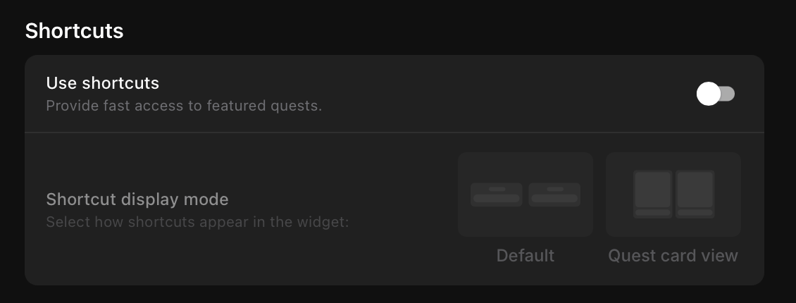
- Default - Compact layout for shortcuts.
- Quest card view - Full card layout, matching the style of other quest cards.
Challenges
Challenges display in the widget as a separate content type, distinct from quests. Use this section to control how challenge cards are arranged.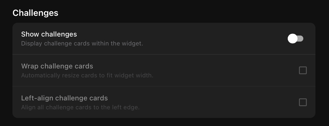
- Wrap challenge cards - Resize and wrap cards to fit the widget width.
- Left-align challenge cards - Align all challenge cards to the left edge.
Groups
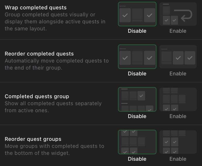
Groups control how quests are displayed and organized within the widget. You can adjust the layout, alignment, navigation, and handling of completed quests.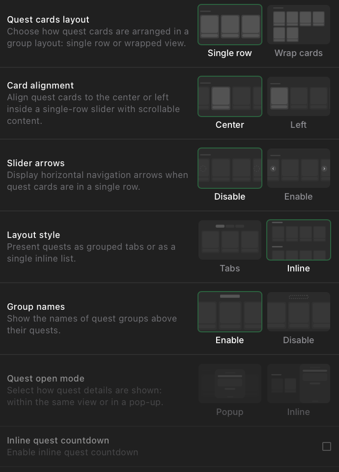
- Single row - all quests are shown in a single horizontal row.
- Wrap cards - quests wrap into multiple rows when space runs out.
- Tabs - quests are grouped under selectable tabs.
- Inline - all quests are shown in a continuous list.
- Enable - displays the name of each quest group above its quests.
- Disable - hides group names for a cleaner layout.
- Available only if Layout style is set to Tabs.
- Options: Popup or Inline.
- Available only if Layout style is set to Tabs and Quest open mode is set to Inline.
Leaderboard
The leaderboard displays top participants inside the widget.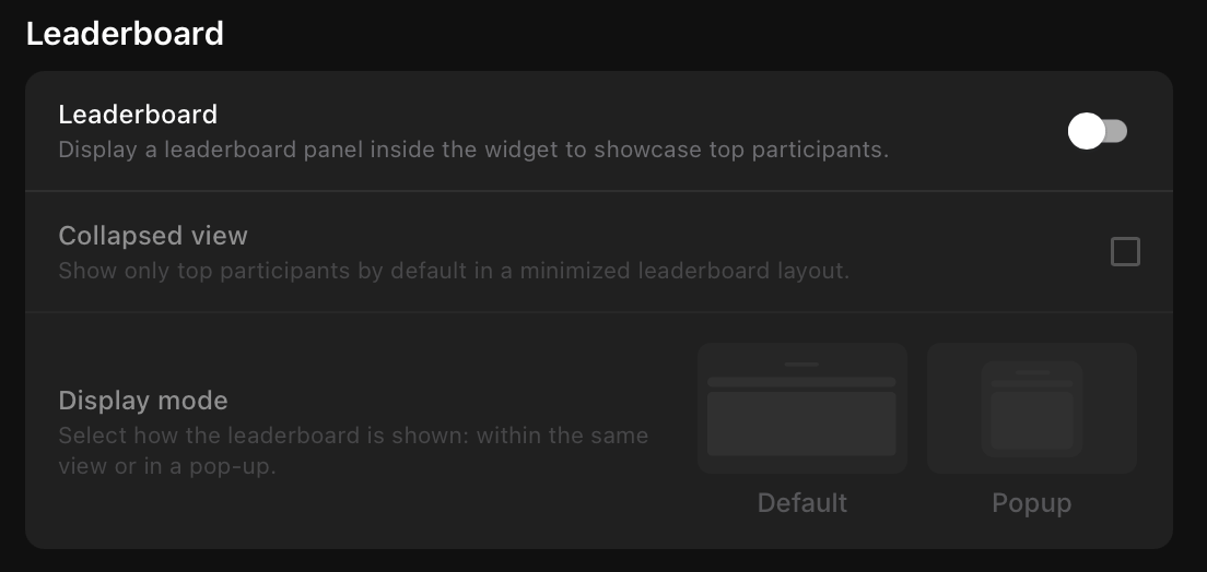
Tasks
Tasks control how individual quest tasks are displayed inside the widget.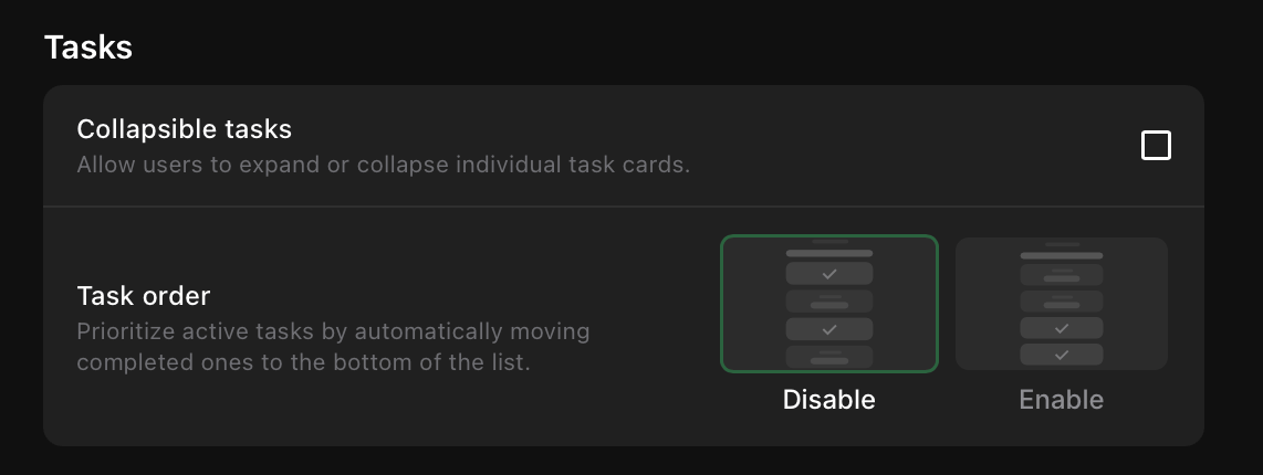
More quests
The More quests section adds an extra section with additional quests at the end of the current view.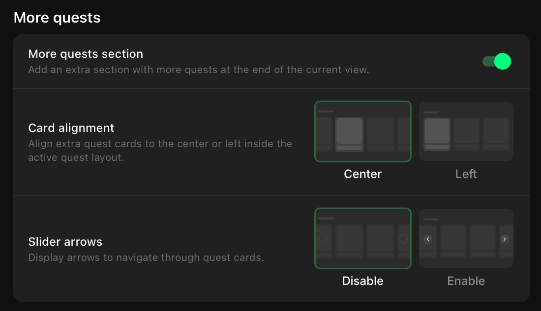
Popups
Use popups to notify users about task completions.
Additional components
Additional components provide extra context and engagement features within the quest widget.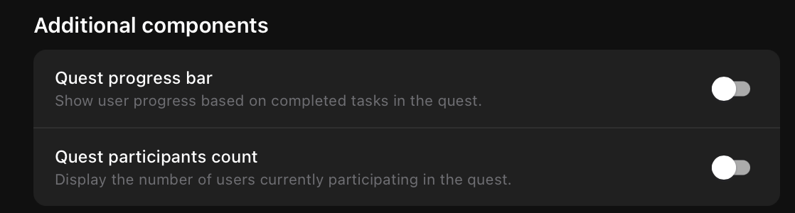
Close button
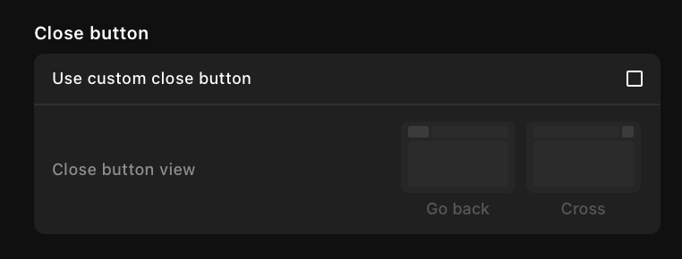
- Go back - displays a back arrow icon that returns the user to the previous view.
- Close icon - displays an X icon that closes the view.