
General requirements
- Purposeful use: Use pop-ups sparingly and only when necessary to avoid disrupting the user flow.
- Clear close option: Provide a prominent and easily accessible close button.
- Visual hierarchy: Use headings, subheadings, and bullet points to organize content.
- Mobile optimization: Ensure pop-ups are responsive and adapt well to smaller screens.
- Accessibility: Design with accessibility in mind, including appropriate color contrast, keyboard navigation, and screen reader compatibility.
Login
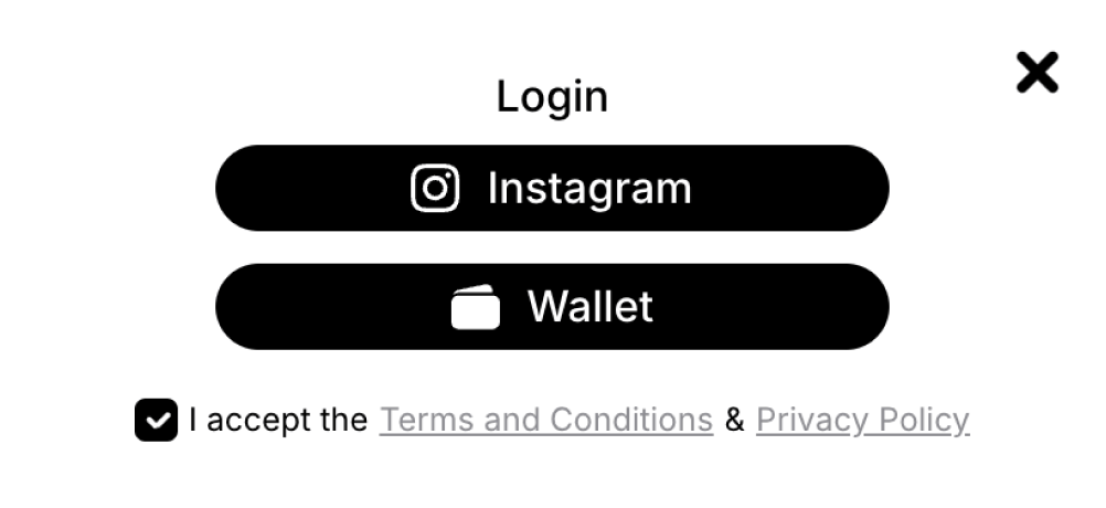
Example: Login pop-up
- Clear purpose: Explain why login is required and its benefits.
- Multiple options: Offer various login methods (e.g., email, social media).
- Error handling: Provide clear error messages and guidance.
Wallet connect
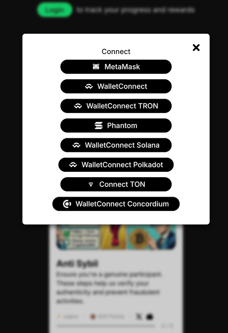
Example: Wallet connect pop-up
- Clear instructions: Provide step-by-step instructions on how to connect a wallet.
- Supported wallets: Display a list of supported wallets and their logos.
- Security information: Assure users about the security of their wallet connection.
- Error handling: Provide clear error messages and troubleshooting tips if connection issues arise.
Platform login
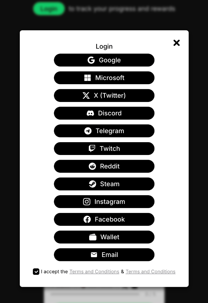
Example: Platforms login pop-up
- Platform branding: Incorporate the branding of the relevant platform for visual consistency.
- Clear instructions: Explain the login process and any required permissions.
- Error handling: Display clear error messages if login attempts fail.
Email login
- Clear input fields: Provide well-labeled input fields for email and password.
- Password recovery: Include a “Forgot Password” link for users who need assistance.
- Error handling: Display clear error messages if login attempts fail.
Completed task
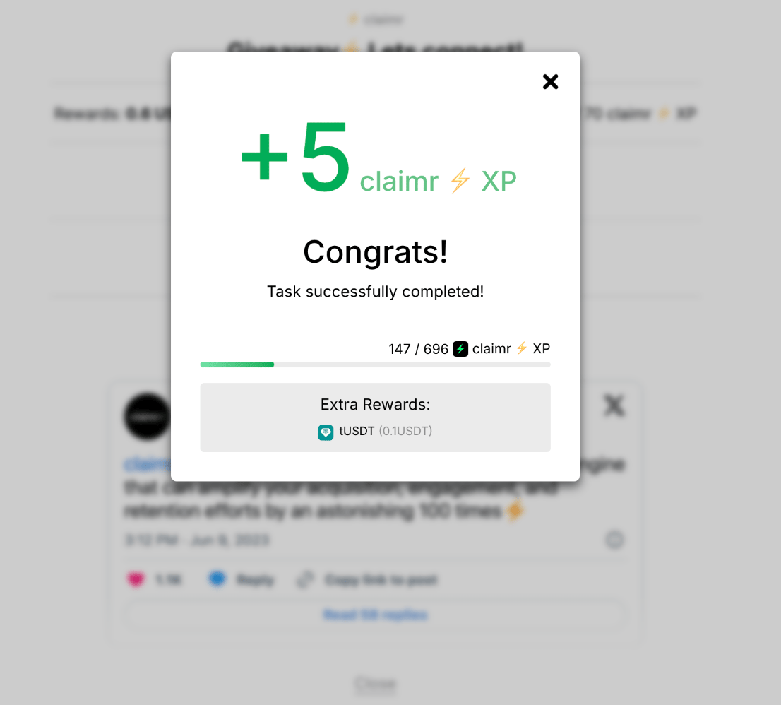
Example: Completed task pop-up
- Congratulatory message: Celebrate the user’s achievement.
- Reward display: Clearly showcase the earned reward.
- Call to action (CTA): Encourage further progress or exploration.
Challenge details
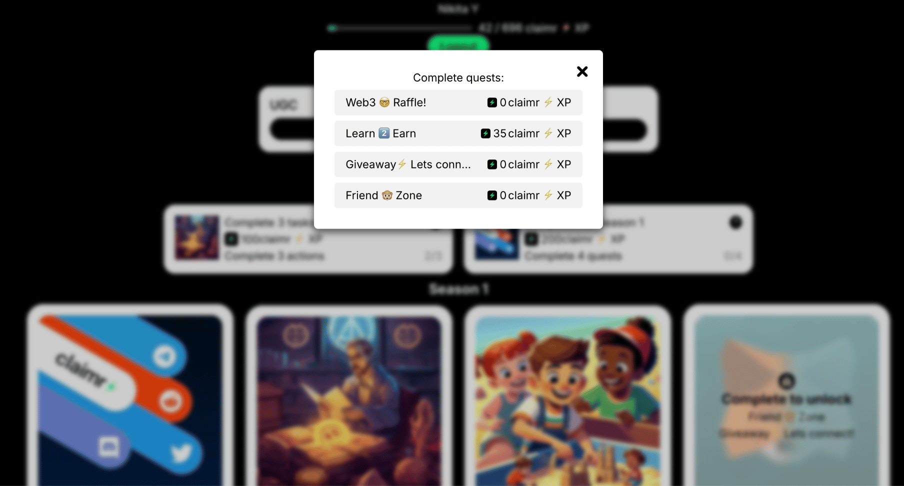
Example: Challenge details pop-up
- Challenge information: Clearly present the challenge’s objectives, rules, rewards, and any time constraints.
- Progress tracking: Include a progress bar or indicator to show the user’s advancement towards the challenge goal.
- CTA: Include a “Participate” or similar button to prompt users to join the challenge.
Leaderboard
- Default view: Displays the full leaderboard with all ranked users visible.
- Collapsed leaderboard state: Only the heading row and the top 9 ranked users are shown when the list is long. Include View more / Hide buttons to expand or collapse the list.
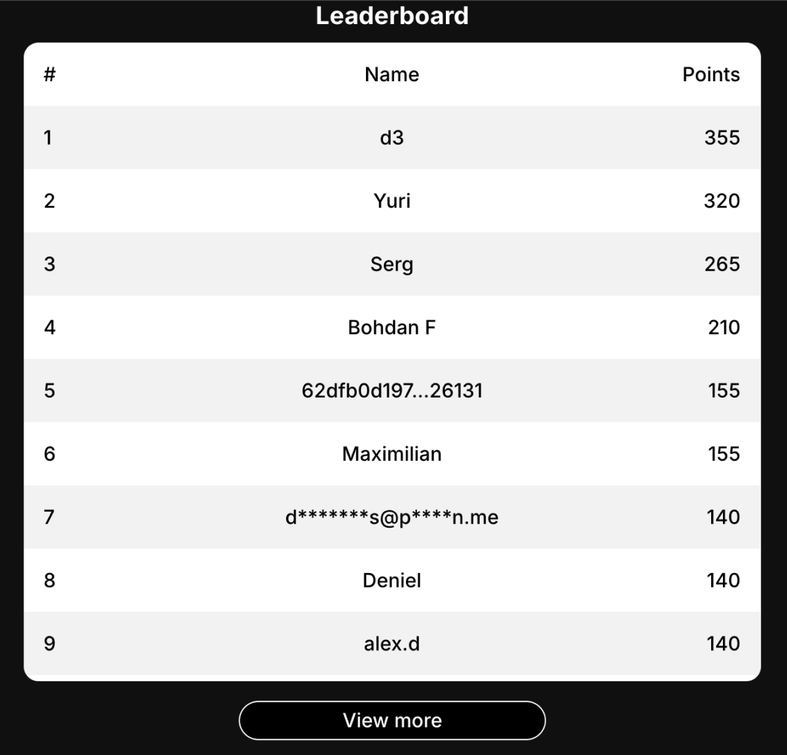
- Leaderboard pop-up: Design the button for flows when the leaderboard appears only after clicking it.

- Collapse button in pop-up: When opened in a modal, include an option to collapse or minimize the leaderboard view.
- Pagination: If the full list is too long to load at once, add pagination to allow users to browse through pages of results.
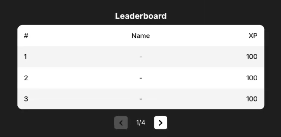
- Clear rankings: Present user rankings and relevant metrics clearly.
- Visual hierarchy: Use size, color, and placement to highlight top performers.
Action status notifications
- Concise message: Provide a brief message about the action’s status.
- Visual cues: Use colors, icons, or animations for visual feedback.
- Additional information: Include relevant details or instructions.