
Understanding Quest cards
Quest cards serve as the primary interface for users to interact with individual quests within your campaign. Each card should provide a clear overview of the quest’s objectives, rewards, and progress, enticing users to embark on the journey.Quest state indicators
Clearly communicate the current state of the quest: Active, Completed, or Locked.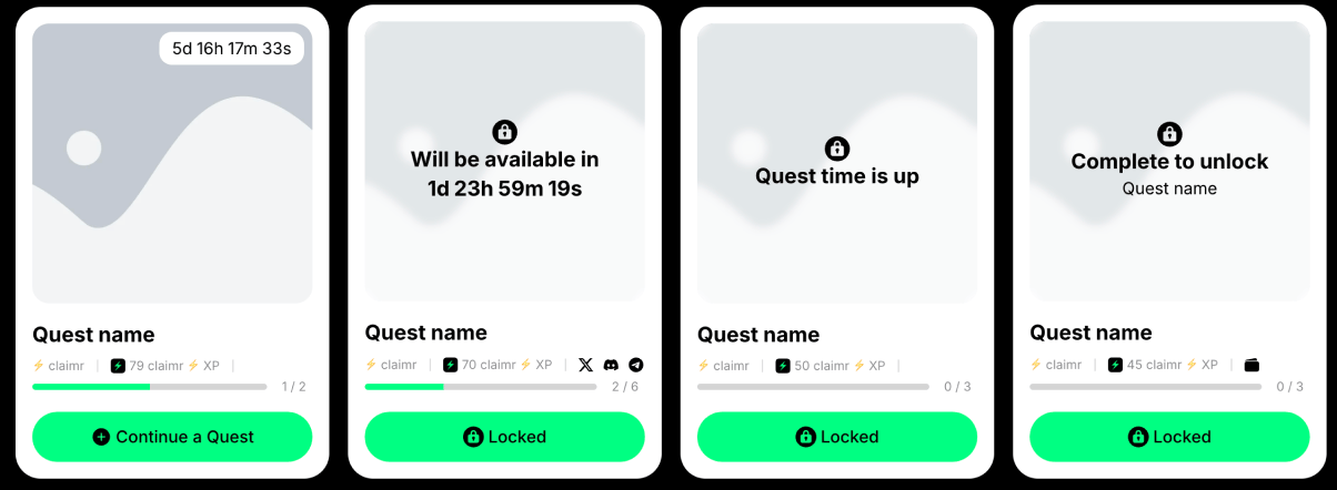
Quests at different states
- Visual clarity: Employ distinct colors, icons, or labels to differentiate between each state.
- Accessibility: Ensure the indicators are easily distinguishable for users with visual impairments.
- Consistency: Maintain a consistent visual style for state indicators across all quests.
- Placement: Position these indicators prominently on the quest card.
Image
Provides a visual representation of the quest’s theme.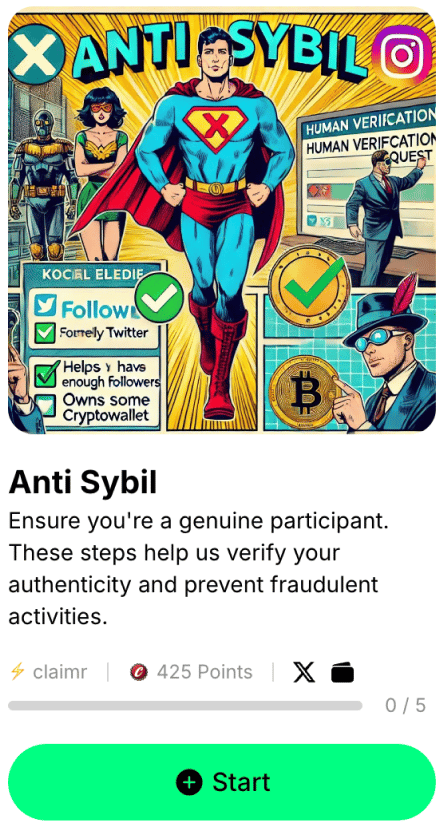
Example: Quest card with an image
- Relevance and quality: Choose high-quality images that are relevant to the quest’s content.
- Size and aspect ratio: Ensure the image is appropriately sized and cropped.
- Accessibility: Provide alternative text descriptions for images.
Quest name
Clearly and concisely conveys the essence of the quest.- Clarity: Use action-oriented language and avoid jargon.
- Length: Keep the title short enough to fit within the card’s layout.
- Hierarchy: Use a larger font size and/or bolder font weight to distinguish the title.
Short quest description
Provides a brief overview of the quest’s objectives and rewards.- Conciseness: Craft a succinct description.
- Clarity: Use plain language and avoid technical terms.
- Enticement: Use persuasive language to encourage participation.
User progress bar
Visually represents the user’s progress towards completing the quest.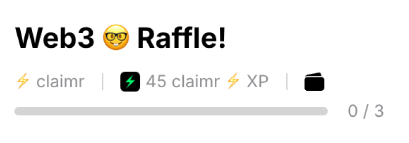
Example: Quest name, user progress bar, rewards, and counter
- Clarity: Use a clear and easily understandable progress indicator.
- Visual feedback: Provide updates to the progress bar as the user completes tasks.
- Accessibility: Ensure the progress bar is accessible to screen readers.
Counters
Display numerical information related to the quest, such as the number of tasks completed or rewards earned.- Clarity: Use clear labels and units of measurement.
- Placement: Position counters near relevant elements.
Rewards
Showcase the rewards that users can earn by completing the quest.- Visual appeal: Use high-quality images or icons to represent the rewards.
- Clarity: Clearly indicate the type and quantity of rewards offered.
CTA button
Prompts users to take action and start or continue the quest.
Example: CTA buttons for different states
- Clarity: Use action-oriented language.
- Visual prominence: Make the button stand out.
- Accessibility: Ensure the button is easily clickable.
- State differentiation: Visually distinguish between active and inactive states.
Quest blockers and dependencies
Display any conditions or requirements that must be met before a user can start or continue a quest.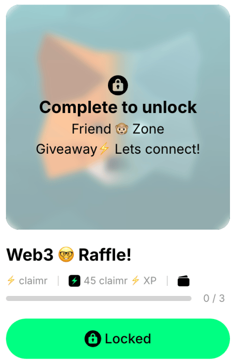
Example: Quest card with dependencies
- Clarity: Clearly communicate the blockers and any actions the user needs to take. Show any other quests that must be completed before this quest can be unlocked.
- Visual cues: Use icons or labels to visually distinguish blockers.
Countdown
Displays a timer for time-sensitive quests.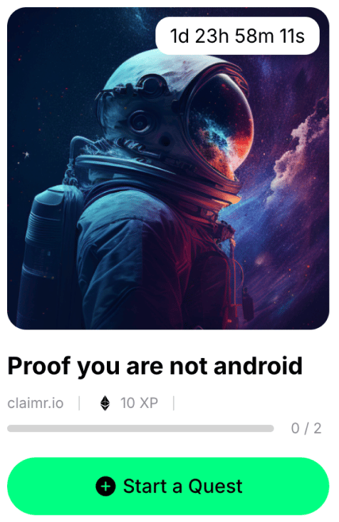
Example: Quest card with a countdown timer
- Clarity: Use a large, easy-to-read font and clear time units.
- Urgency: Consider using color or animation to create a sense of urgency.